| In Lesson 9 of Pam Carriker's book Creating Art At the Speed of Life, we were to use the end of a pencil to create dots of color on the page with acrylic paint. In this chapter she included a quote from Claude Monet which I love and have to repeat it here... People discuss my art and pretend to understand as if it were necessary to understand, when it's simply necessary to love. ” - Claude Monet If that is the test, then I guess this attempt was a success, because I LOVE this pretty impressionistic girl. She is lovely. I mixed my own colors and was very happy with how they worked together. I also really liked how slowly the image came to life, one dot at a time. It was the most fun I've ever had with the eraser of a pencil. I will try more like this on canvas later.  |
| First Impressionism Art Journal Page by Cheryl Harris White Acrylic |

Celebrating Color, Light and Life!
Saturday, December 28, 2013
Art At The Speed of Life Lesson 9
Sunday, December 22, 2013
Art At The Speed of Life Lesson 8
 |
| Snowflake Texture Art Journal Pages by Cheryl Harris White I was surprised at how easily the graphite image could just be rubbed onto the page. I want to do this one again. |
Thursday, December 12, 2013
Art At the Speed Of Life Lesson 7
This chapter is exploring textures and in this lesson we were to use crayon resist, saran wrap, salt and rubbing alcohol to activate the spreading and texture of paint around a sketch. Honestly, the ONLY thing I liked about this one was the actual sketch. The fun part of this whole process is actually evaluating the results while I try each of the techniques. So, even though I'm not happy with the effects of the saran wrap, I am happy with the process.
 |
| Multi Tasking Java Junkie Art Journal Page by Cheryl Harris White Mixed Media |
Tuesday, December 10, 2013
Art At The Speed of Life Lesson 6
This one turned out quite a bit different than the example in Lesson 6 of Creating Art At the Speed of Life by Pam Carriker. In the book, it is a much more abstract design that is created by the pattern of paint under saran wrap. My attempts just seemed to naturally become the edge of a forest with light just beyond. I have noticed a theme in my forest paintings lately, and that is that in almost all of them, I paint from the perspective of being deep inside the forest and coming out of it, toward light. How similar this is to my own life as well... and refreshing. To complete this lesson, I used heavy water color paper, diluted acrylic paint, slow drying gel, permanent ink pens, white gel pen, saran wrap and salt. The patterns of paint were created first and the outlining was done after it dried around the natural shapes it created.
 |
| Dark and Deep Art Journal Page by Cheryl Harris White Mixed Media |
Monday, December 9, 2013
Art At the Speed of Life Lesson 5
Continuing to work through Creating Art At the Speed of Life by Pam Carriker. . . In this lesson we were to choose two complementary colors. Here's another art vocabulary word. Complementary - The colors opposite each other on the color wheel. I chose red and aqua and the theme of LOVE. I loved the color combo and the grouping of the collage elements at the bottom of the page. They look as if they have actually fallen downs and are caught behind a wire barrier. I used diluted acrylic paint, slow dry blending gel, water color pencil, magazine and paper scraps, white gel pen, permanent ink pen, mod podge and stickers.
 |
| Complementary Love Art Journal Page by Cheryl Harris White Mixed Media |
Sunday, December 8, 2013
Art At the Speed of Life Lesson 4
Lesson 4 One Color At A Time
The objective here was to use different media materials in only one color to make a monochromatic journal spread. I chose green, cool as a cucumber. I feel relaxed when I look at this page. Materials used were heavy water color paper, diluted acrylic paint, slow dry blending gel, magazine and paper scraps, mod podge, white gel pen, permanent ink pens and the directions in Pam Carriker's book Creating Art at the Speed of Life.
The objective here was to use different media materials in only one color to make a monochromatic journal spread. I chose green, cool as a cucumber. I feel relaxed when I look at this page. Materials used were heavy water color paper, diluted acrylic paint, slow dry blending gel, magazine and paper scraps, mod podge, white gel pen, permanent ink pens and the directions in Pam Carriker's book Creating Art at the Speed of Life.
 |
| Monochromatic Monarch Mixed Media Art Journal Page by Cheryl Harris White |
Saturday, December 7, 2013
Art At The Speed of Life Lesson 3
 |
| Analogous Analogy Mixed Media Art Journal Page by Cheryl Harris White The assignment was to use analogous colors to create a journal page. Analogous means two colors that are next to each other on the color wheel. I liked using masking fluid and permanent markers to create the opposing wavy lines and adding the white gel pen details to help it pop. The layers of color were a fast easy way to create a background. |
Friday, December 6, 2013
Art At The Speed of Life Lessons 1 & 2
 |
| Color Wheel Mixed Media Art Journal Page by Cheryl Harris White Still working out of the Art At the Speed of Life book by Pam Carriker. The first two exercises created a two page spread at the beginning of the Handmade Art Journal. I thought the color wheel in exercise 1 was fun. I didn't have a coffee filter, so I used paper towel instead. If I did this again, I would try it with a filter and attempt to show more of the red-violet and blue-violet on the wheel. On exercise 2 I used art vocabulary words to fill each section of the page. The paint is a mixture of acrylic, water and gel to retard the drying process. On this page a black water color pencil was also used for shading, as well as permanent marker and white gel pen. I loved the effect of the water soluble pencil and will try more with this later. I liked using the diluted paint. It behaves a lot like water color off the brush allowing layers to be laid down on top of each other, but the colors pop so much much more. I must do more of this. |
 |
| Lesson 1 - Color Wheeling |
 |
| Lesson 2 - Colorful Language |
Tuesday, December 3, 2013
Creating Art at the Speed of Life Journal Cover
I found a book called
Creating Art at the Speed of Life: 30 Days of Mixed-Media Exploration by
and it looked interesting. I brought it home and decided to try it. This is the cover for the journal done with watercolor crayons, water, markers and a little masking fluid on heavy adhesive canvas. This will be attached on the outside as a cover for the home made journal.
 |
| Cover for Handmade Art Journal |
The cover was painted on adhesive canvas pictured above. After sewing the blank pages for the journal together, I just peeled the back off the back of the canvas and stuck it on like a book cover. The result is below. I loved how easy using the adhesive canvas made this.
 |
| Back |
 |
| Front |
Thursday, November 28, 2013
Give Thanks for Messy

I made this Thanksgiving Wreath for a fundraiser benefit and it sold for $75.00! I loved using some non traditional fall colors like pale yellowish greens and purples in this wreath and creating the messy raffia bow. It reminds me that our lives don't follow the expected pattern sometimes and can be very messy, but in the midst of that mess, we are to give thanks. I posted it today because it reminds me to count my blessings. I am truly thankful for the gift of creativity and the chance to share it with people I love. Wishing you all a wonderful Thanksgiving close to the loved ones who make your lives messy.
Saturday, October 12, 2013
Colors set to music: Stained Glass by Keith Green
I grew up listening to Keith Green's amazing music and much of it has inspired my painting. I am thankful for every note. Enjoy!
Thursday, October 10, 2013
Red Tree With Blue Leaves By the River
 |
| Red Tree With Blue Leaves By the River by Cheryl Harris White Acrylic Collage on Canvas 18" x 24" The fourth piece in my tree series is the most whimsical of them all. There are fish making up it's roots, birds at the river and hearts carved into it's trunk. It is happily accompanied here by the perfect quote from William Shakespeare... And this, our life, exempt from public haunt, finds tongues in trees, books in the running brooks, sermons in stones, and good in everything. ~William Shakespeare |
Sunday, October 6, 2013
Orange Tree With Purple Leaves
 |
| Orange Tree With Purple Leaves by Cheryl Harris White Acrylic Collage on Canvas 18" x 24" |
I like trees because they seem more resigned to the way they have to live than other things do. ~Willa Cather, 1913
Thursday, October 3, 2013
Shining Green Birch Trees
 |
| Shining Green Birch Oil on Canvas by Cheryl Harris White 12 x 12 This was a fun little oil painting to do inspired by a few lines of poetry I came across. I used a lot of light shades of greens and yellows which makes the forest seem to shimmer. Happy to be playing in my oil paint again! The trees are God's great alphabet; With them He writes in shining green Across the world His thoughts serene. - Leonora Speyer |
Sunday, September 15, 2013
Memories
 |
| Memories Acrylic and Collage on Canvas by Cheryl Harris White 3 ft x 3 ft $200.00 In our yard in Ohio, when I was a child, there was a huge weeping willow tree. Under it, my little sister and I used to play for hours and have tea parties. We moved to Texas, when I was 8 years old and I have never returned, but I remember it like it was yesterday, and those moments were the inspiration behind this piece. |
Friday, August 2, 2013
Camino Global

Camino Global
by Cheryl Harris White
Acrylic on Canvas
4' x 4'
SOLD
SOLD
I love how the dance of these bright oranges and reds on this huge square canvas. This was a painting for the director of Camino Global where Duke works. It is full of texture and passion. I loved doing the cross because it reminded me of a path of stepping stones to be followed. That is what we are all really doing anyway... taking a long journey, one step at a time.
Friday, April 26, 2013
Being a Part of Something Beautiful
There are a few more days to see this show at the MCL Grand. More new artwork is coming soon.
I love participating in art shows. It's not about selling the art or winning a prize. . . to me, what makes doing this worth while is just being a part of something beautiful.
There 
Monday, March 25, 2013
10,000 hours of painting
I am currently reading an interesting book about success. One could apply it to business, or sports, or art, or anything you want to be good at really. The name of the book is Outliers by Malcom Gladwell and it is based on the premise that to be really successful at any one thing, it takes practicing it 10,000 hours. It's daunting to imagine painting for 10,000 hours. I often feel robbed of my art time, now that I have to work 40 hours a week. There was a season in my life when I only worked part time and I had so many more hours in my week to spend painting. But even working full time, I can still find precious art hours to invest each week. My plan is to just be thankful for the hours I have already spent painting, and build from there without stressing about it. Even if I start on a canvas and gesso the whole thing over to start again, according to this book, it is time never wasted. The hours were spent practicing... so they do matter. They make a difference, and they count. So I continue to paint.
“Practice isn't the thing you do when you're good. It's the thing you do that makes you good.”
― Malcolm Gladwell, Outliers: The Story of Success
“Practice isn't the thing you do when you're good. It's the thing you do that makes you good.”
― Malcolm Gladwell, Outliers: The Story of Success
Sunday, March 24, 2013
Come see "Free Form" March 9-April 27


Sunday, March 3, 2013
Red Tree with Green Leaves

Red Tree with Green Leaves
by Cheryl Harris White
Acrylic Collage
by Cheryl Harris White
Acrylic Collage
18" x 24"
$75.00
$75.00
I liked the way this cool misty background turned out on this one. I also like the idea of creating these trees with what ever color bark I choose instead of the same grayish tan bark we see on real trees everyday. The result was in this piece, the roots ant the bark is what my eye most enjoys looking at. These colors remind me of summer.
Saturday, March 2, 2013
Intended to Grow
This is one of a series of four trees I have been finishing up. The thing I liked most about doing these pieces, was how they grew as I worked. Each layer became a platform for the next...until it was full and beautiful. I just love things that grow. There is one tree at the corner of our house that the previous owners had topped off and it hasn't grown since. It is quite an annoyance, just sitting there taking up space, reminding me each day of it's wasted potential. I think people are a lot like trees. Some of them grow and it is beautiful to watch... but others are so damaged that they just sit there doing nothing. We, and trees, were intended to grow, and that is how I prefer it.
 | |
| Green Tree with Blue Leaves by Cheryl Harris White Acrylic Collage 18" x 24" $75.00 |
Friday, February 15, 2013
Spring Cleaning
 |
| Studio Mixed Media Collage on Canvas 36" x 12" UNAVAILABLE |
Saturday, January 5, 2013
My hand shake with 2013
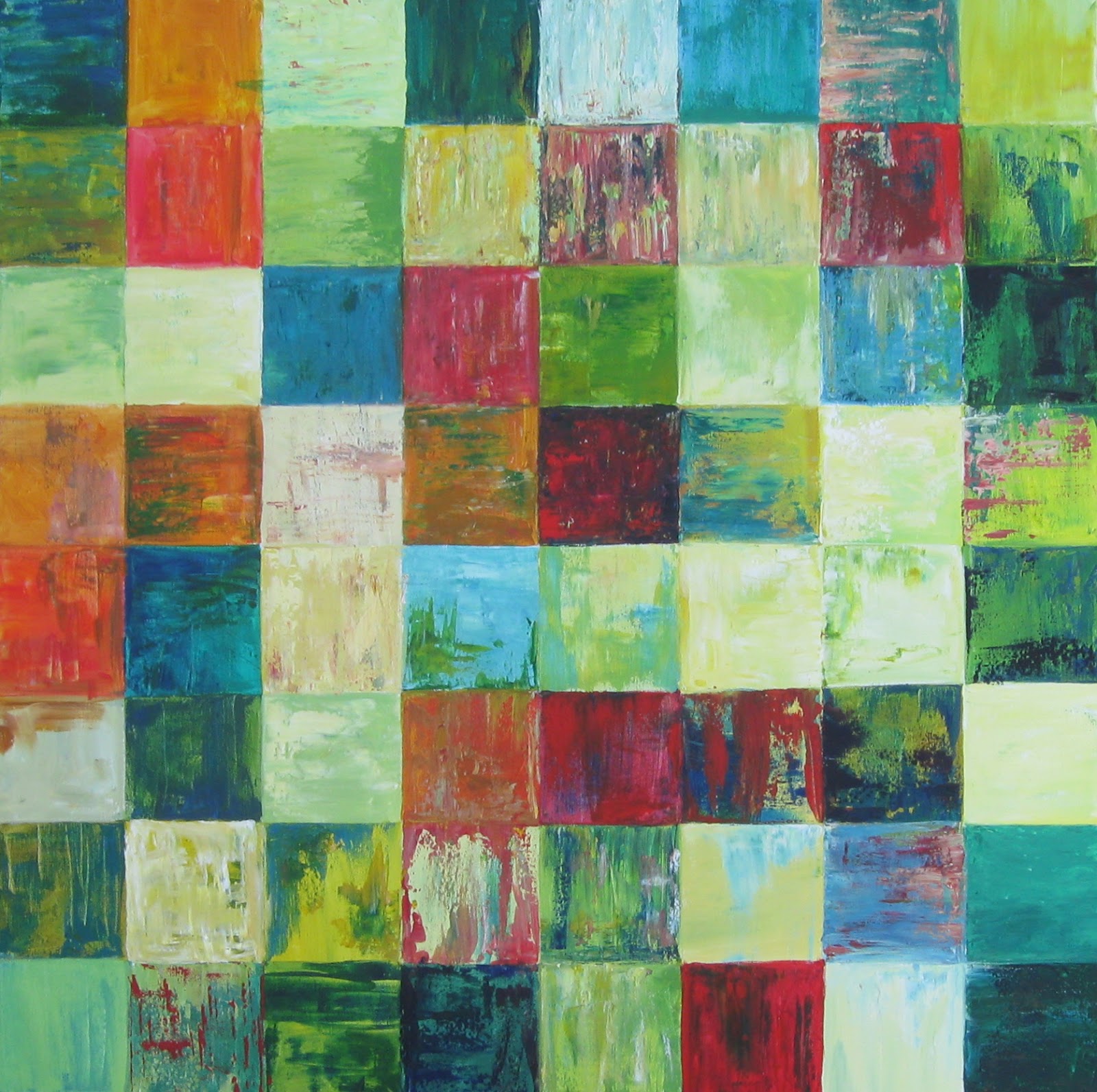 |
| 2013 Hand Shake by Cheryl Harris White Acrylic on Canvas 36" x 36" $200.00 This my handshake with 2013 saying, "Hello, my name is Cheryl. It's nice to meet you." I'm not greeting 2013 with a list of promises or things I want to change or with the ridiculous mindset that this year will be better than the others, with fewer set backs, less losses, more successes than the years before. We don't do that with people. When we first meet them, do we say, "Hello, my name is Cheryl, I'm not that great right now, but soon I'm going to reduce the amount of time I spend playing video games, be a better person, give more to charity, lower my sodium intake and get really skinny." Not really. When I meet a new person, I just like to listen to them, make eye contact and try to find something to like about them, which doesn't usually take very long. 2013 is the same to me. It's just like any new acquaintance I meet... It's a new door I've never walked through... An interesting new friend I plan on getting to know. I liked exploring that idea with each square on this painting. Each empty square was a new beginning. I stuck with a lot of green and yellow in the color palate but loved adding in some orange and red pops of color. Each square turned out a little different, but together they make a very interesting visual combination. |
Subscribe to:
Posts (Atom)